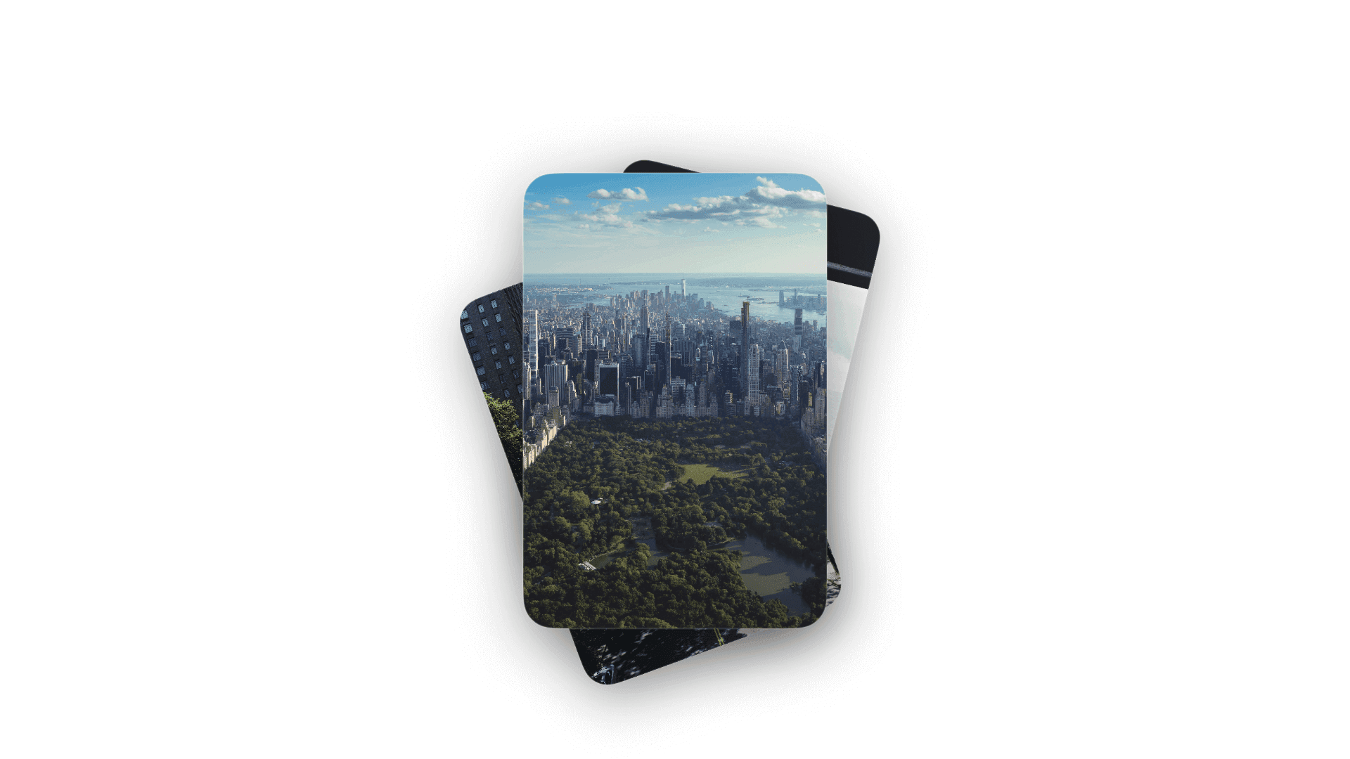
Stacked Images
by dockui
Reusable SwiftUI stacked image cards component with layered depth effects, rotations, scaling, and rounded corners.
- Platform
- SwiftUI
- Code
- Native Swift
- Format
- Component
- Access
- Free
Code Snippet
import SwiftUI

/// StackedImagesView - A SwiftUI component that displays three overlapping image cards
/// Creates a layered, depth effect similar to stacked cards or screens
struct StackedImagesView: View {
    // MARK: - Properties

    /// Array of image names to display in the stacked cards
    let imageNames: [String]

    /// Spacing offset between each stacked card
    private let cardOffset: CGFloat = 20

    /// Rotation angle for the cards to create depth effect
    private let cardRotation: Double = 20

    /// Corner radius for the rounded rectangle cards
    private let cornerRadius: CGFloat = 20

    /// Scale factor for background cards (makes them appear smaller/farther)
    private let backgroundCardScale: CGFloat = 0.9

    // MARK: - Initializer

    /// Initialize with an array of image names
    /// - Parameter imageNames: Array of image asset names (defaults to profile images)
    init(imageNames: [String] = ["profile1", "profile2", "profile3"]) {
        self.imageNames = imageNames
    }

    var body: some View {
        // Stacked image cards
        stackedCardsView
            .frame(maxWidth: .infinity, maxHeight: .infinity)
            .padding()
    }

    /// Container for all stacked cards
    private var stackedCardsView: some View {
        ZStack {
            // Render cards from back to front
            // Card 3 (backmost)
            if imageNames.count > 2 {
                imageCard(
                    imageName: imageNames[2],
                    offset: CGSize(width: -cardOffset * 1.5, height: cardOffset * 1.5),
                    rotation: -cardRotation,
                    scale: backgroundCardScale,
                    zIndex: 1
                )
            }

            // Card 2 (middle)
            if imageNames.count > 1 {
                imageCard(
                    imageName: imageNames[1],
                    offset: CGSize(width: cardOffset, height: -cardOffset),
                    rotation: cardRotation * 0.7,
                    scale: backgroundCardScale * 0.98,
                    zIndex: 2
                )
            }

            // Card 1 (frontmost)
            if imageNames.count > 0 {
                imageCard(
                    imageName: imageNames[0],
                    offset: .zero,
                    rotation: 0,
                    scale: 1.0,
                    zIndex: 3
                )
            }
        }
        .frame(width: 300, height: 400)
    }

    // MARK: - Helper Methods

    /// Creates an individual image card with styling and transformations
    /// - Parameters:
    ///   - imageName: Name of the image asset
    ///   - offset: X and Y offset for positioning
    ///   - rotation: Rotation angle in degrees
    ///   - scale: Scale factor for the card
    ///   - zIndex: Z-index for layering
    /// - Returns: A styled image card view
    private func imageCard(
        imageName: String,
        offset: CGSize,
        rotation: Double,
        scale: CGFloat,
        zIndex: Double
    ) -> some View {
        Image(imageName)
            .resizable()
            .aspectRatio(contentMode: .fill)
            .frame(width: 200, height: 300)
            .clipShape(RoundedRectangle(cornerRadius: cornerRadius))
            .overlay(
                // Subtle border/glow effect
                RoundedRectangle(cornerRadius: cornerRadius)
                    .stroke(
                        LinearGradient(
                            colors: [
                                Color.white.opacity(0.3),
                                Color.white.opacity(0.1)
                            ],
                            startPoint: .topLeading,
                            endPoint: .bottomTrailing
                        ),
                        lineWidth: 1
                    )
            )
            .shadow(
                color: Color.black.opacity(0.4),
                radius: 20,
                x: 0,
                y: 10
            )
            .offset(offset)
            .rotationEffect(.degrees(rotation))
            .scaleEffect(scale)
            .zIndex(zIndex)
    }
}
More Templates
More Templates
View All TemplatesSimilar Blogs
View All Articles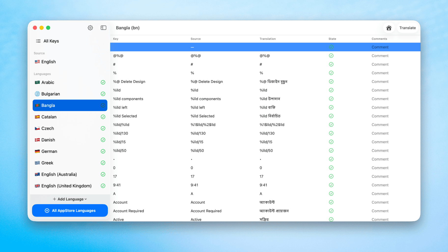
How to Translate Xcode String Catalogs with AI
Learn how to efficiently translate Xcode string catalogs using AI fast, streamlining localization for your iOS and SwiftUI applications.
by dockui
May 4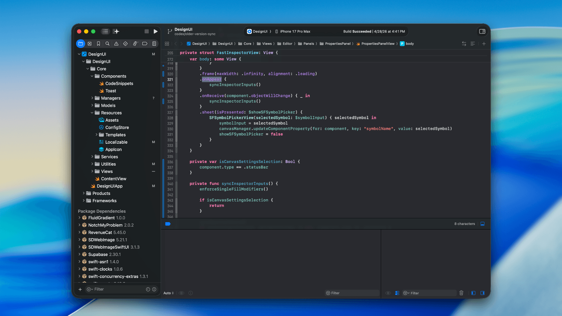
How to optimize your SwiftUI app in 2026
Discover top strategies to optimize your SwiftUI app in 2026, enhancing performance, responsiveness, and maintainability with modern concurrency.
by dockui
Apr 29
SwiftUI: iOS Confirmation Alert (Confirm + Cancel)
SwiftUI iOS confirmation alert with Confirm and Cancel buttons. Beginners guide to building safe actions, destructive deletes, and commit dialogs.
by dockui
Nov 11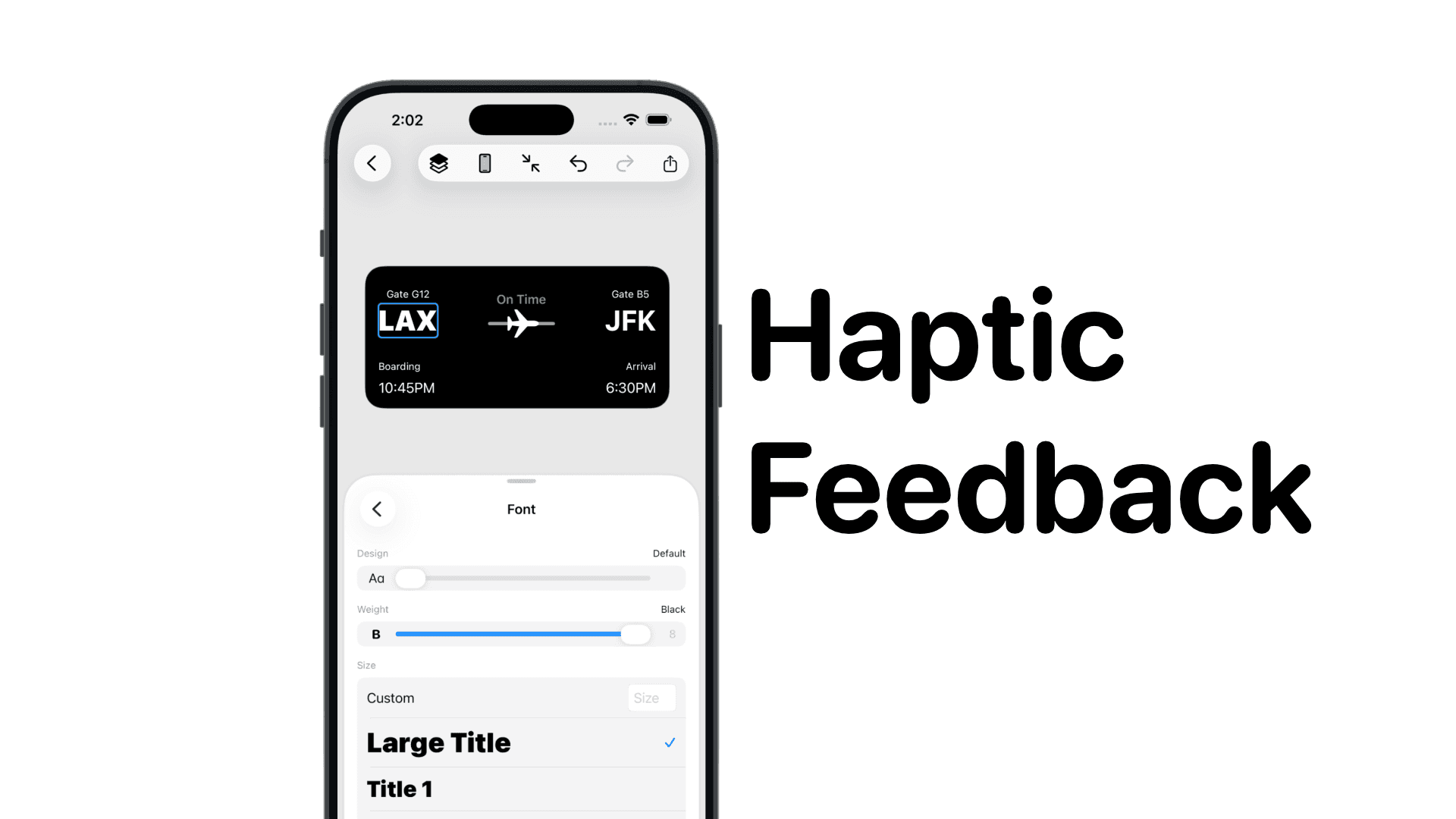
SwiftUI: IOS Haptic Feedback Guide 2026
Add click to vibrate haptic feedback in SwiftUI. Full guide to UIImpactFeedbackgenerator, success, error, selection, and tap vibration patterns with code.
by dockui
Nov 11Code copied to clipboard!