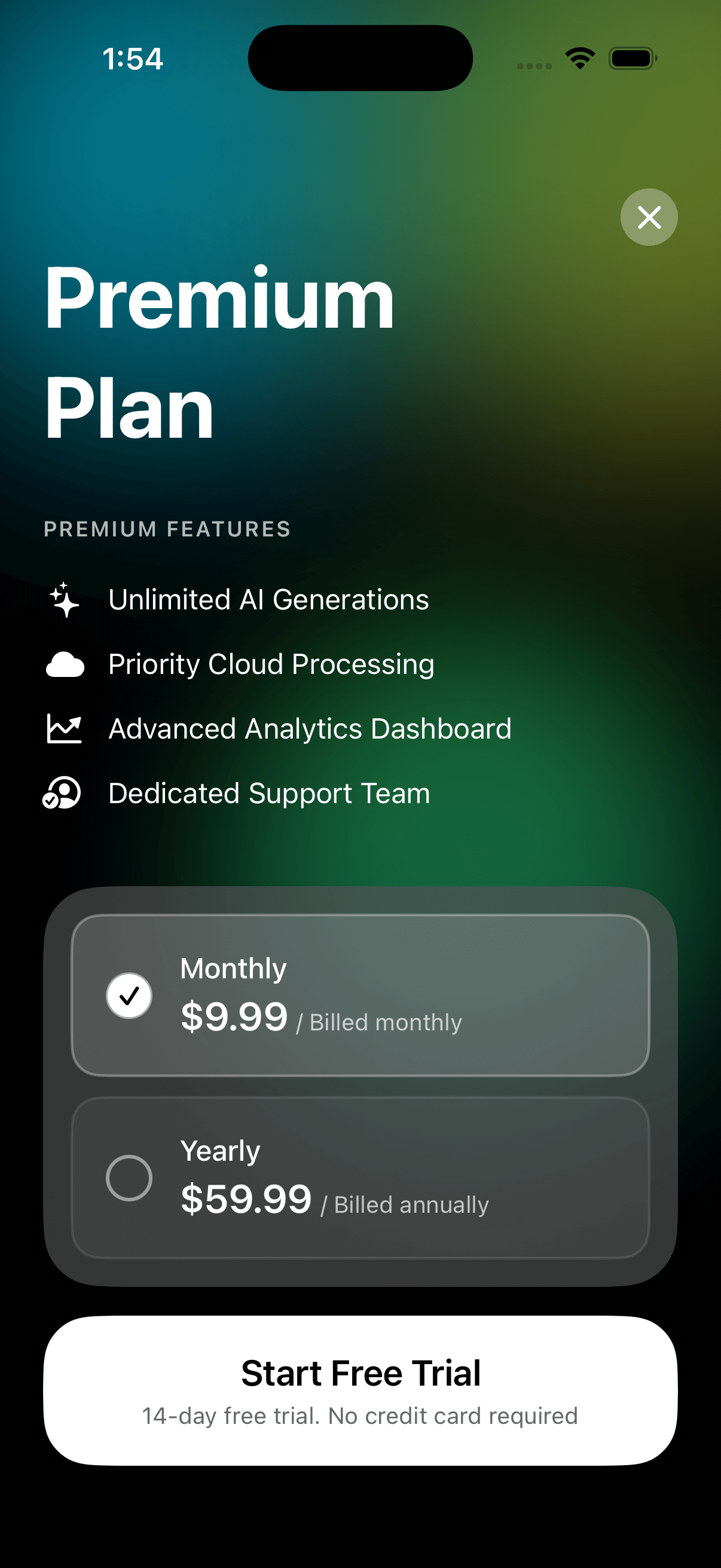
Subscription Plan View
by dockui
Premium SwiftUI upgrade screen with animated gradient backgrounds, glassmorphism pricing cards, feature highlights, and plan selection.
- Platform
- SwiftUI
- Code
- Native Swift
- Format
- Screen
- Access
- Free
Code Snippet
import SwiftUI

struct ProUpgradeView: View {
    @Environment(\.dismiss) private var dismiss
    @State private var selectedPlan: PricingPlan = .yearly

    var body: some View {
        ZStack {
            // Background with gradient shapes
            Color.black
                .ignoresSafeArea()

            // Animated gradient blobs
            GeometryReader { geometry in
                // Top left blob - cyan
                Circle()
                    .fill(
                        LinearGradient(
                            gradient: Gradient(colors: [
                                Color.cyan.opacity(0.8),
                                Color.cyan.opacity(0.4)
                            ]),
                            startPoint: .topLeading,
                            endPoint: .bottomTrailing
                        )
                    )
                    .frame(width: 300, height: 300)
                    .blur(radius: 60)
                    .offset(x: -50, y: -50)

                // Top right blob - lime green
                Circle()
                    .fill(
                        LinearGradient(
                            gradient: Gradient(colors: [
                                Color.green.opacity(0.7),
                                Color.yellow.opacity(0.5)
                            ]),
                            startPoint: .topLeading,
                            endPoint: .bottomTrailing
                        )
                    )
                    .frame(width: 350, height: 350)
                    .blur(radius: 70)
                    .offset(x: geometry.size.width - 200, y: -100)

                // Middle blob - green
                Circle()
                    .fill(
                        LinearGradient(
                            gradient: Gradient(colors: [
                                Color.green.opacity(0.6),
                                Color.mint.opacity(0.4)
                            ]),
                            startPoint: .top,
                            endPoint: .bottom
                        )
                    )
                    .frame(width: 280, height: 280)
                    .blur(radius: 50)
                    .offset(x: geometry.size.width * 0.3, y: geometry.size.height * 0.4)
            }
            .ignoresSafeArea()

            // Main content with blur
            VStack(alignment: .leading, spacing: 0) {
                // Header
                HStack {

                    Spacer()

                    // Close button
                    Button(action: { dismiss() }) {
                        Image(systemName: "xmark")
                            .font(.system(size: 16, weight: .semibold))
                            .foregroundColor(.white)
                            .frame(width: 32, height: 32)
                            .background(Color.white.opacity(0.3))
                            .clipShape(Circle())
                    }
                }
                .padding(.horizontal, 24)
                .padding(.top, 60)

                // Title
                VStack(alignment: .leading, spacing: 4) {
                    Text("Premium")
                        .font(.system(size: 48, weight: .bold))
                        .foregroundColor(.white)

                    Text("Plan")
                        .font(.system(size: 48, weight: .bold))
                        .foregroundColor(.white)
                }
                .padding(.horizontal, 24)

                // Features section
                VStack(alignment: .leading, spacing: 12) {
                    Text("PREMIUM FEATURES")
                        .font(.system(size: 12, weight: .semibold))
                        .foregroundColor(.white.opacity(0.7))
                        .tracking(1)
                        .padding(.bottom, 8)

                    FeatureRow(icon: "sparkles", text: "Unlimited AI Generations")
                    FeatureRow(icon: "cloud.fill", text: "Priority Cloud Processing")
                    FeatureRow(icon: "chart.line.uptrend.xyaxis", text: "Advanced Analytics Dashboard")
                    FeatureRow(icon: "person.crop.circle.badge.checkmark", text: "Dedicated Support Team")
                }
                .padding(.horizontal, 24)
                .padding(.vertical, 32)

                Spacer()

                // Pricing cards with glassmorphism
                VStack(spacing: 12) {
                    PricingCard(
                        plan: .monthly,
                        isSelected: selectedPlan == .monthly,
                        action: { selectedPlan = .monthly }
                    )

                    PricingCard(
                        plan: .yearly,
                        isSelected: selectedPlan == .yearly,
                        action: { selectedPlan = .yearly }
                    )
                }
                .padding()
                .background(
                    ZStack {
                        // Blur background
                        RoundedRectangle(cornerRadius: 32)
                            .fill(Color.black.opacity(0.4))
                            .background(.ultraThinMaterial)
                            .cornerRadius(32)
                    }
                )
                .padding(.horizontal, 24)

                // Upgrade button
                Button(action: {
                    // Handle upgrade action
                }) {
                    VStack(spacing: 4) {
                        Text("Start Free Trial")
                            .font(.system(size: 20, weight: .semibold))
                            .foregroundColor(.black)

                        Text("14-day free trial. No credit card required")
                            .font(.system(size: 13, weight: .regular))
                            .foregroundColor(.black.opacity(0.6))
                    }
                    .frame(maxWidth: .infinity)
                    .padding(.vertical, 20)
                    .background(Color.white)
                    .cornerRadius(28)
                }
                .padding(.horizontal, 24)
                .padding(.top, 16)
                .padding(.bottom, 40)
            }
        }
    }
}

// MARK: - Feature Row
struct FeatureRow: View {
    let icon: String
    let text: String

    var body: some View {
        HStack(spacing: 12) {
            Image(systemName: icon)
                .font(.system(size: 18, weight: .medium))
                .foregroundColor(.white)
                .frame(width: 24, height: 24)

            Text(text)
                .font(.system(size: 16, weight: .regular))
                .foregroundColor(.white)
        }
    }
}

// MARK: - Pricing Plan Enum
enum PricingPlan {
    case monthly
    case yearly

    var title: String {
        switch self {
        case .monthly: return "Monthly"
        case .yearly: return "Yearly"
        }
    }

    var price: String {
        switch self {
        case .monthly: return "$9.99"
        case .yearly: return "$59.99"
        }
    }

    var subtitle: String {
        switch self {
        case .monthly: return "/ Billed monthly"
        case .yearly: return "/ Billed annually"
        }
    }
}

// MARK: - Pricing Card
struct PricingCard: View {
    let plan: PricingPlan
    let isSelected: Bool
    let action: () -> Void

    var body: some View {
        Button(action: action) {
            HStack(spacing: 16) {
                // Radio button
                ZStack {
                    Circle()
                        .stroke(Color.white.opacity(0.5), lineWidth: 2)
                        .frame(width: 24, height: 24)

                    if isSelected {
                        Circle()
                            .fill(Color.white)
                            .frame(width: 24, height: 24)

                        Image(systemName: "checkmark")
                            .font(.system(size: 12, weight: .bold))
                            .foregroundColor(.black)
                    }
                }

                // Plan details
                VStack(alignment: .leading, spacing: 4) {
                    Text(plan.title)
                        .font(.system(size: 16, weight: .medium))
                        .foregroundColor(.white)

                    HStack(alignment: .firstTextBaseline, spacing: 4) {
                        Text(plan.price)
                            .font(.system(size: 22, weight: .semibold))
                            .foregroundColor(.white)

                        Text(plan.subtitle)
                            .font(.system(size: 13, weight: .regular))
                            .foregroundColor(.white.opacity(0.7))
                    }
                }

                Spacer()
            }
            .padding(20)
            .background(
                RoundedRectangle(cornerRadius: 16)
                    .fill(isSelected ? Color.white.opacity(0.15) : Color.white.opacity(0.05))
                    .overlay(
                        RoundedRectangle(cornerRadius: 16)
                            .stroke(isSelected ? Color.white.opacity(0.3) : Color.white.opacity(0.1), lineWidth: 1.5)
                    )
            )
        }
        .buttonStyle(PlainButtonStyle())
    }
}
More Templates
More Templates
View All TemplatesSimilar Blogs
View All Articles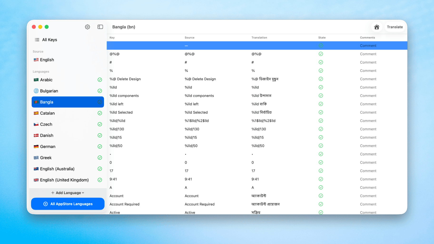
How to Translate Xcode String Catalogs with AI
Learn how to efficiently translate Xcode string catalogs using AI fast, streamlining localization for your iOS and SwiftUI applications.
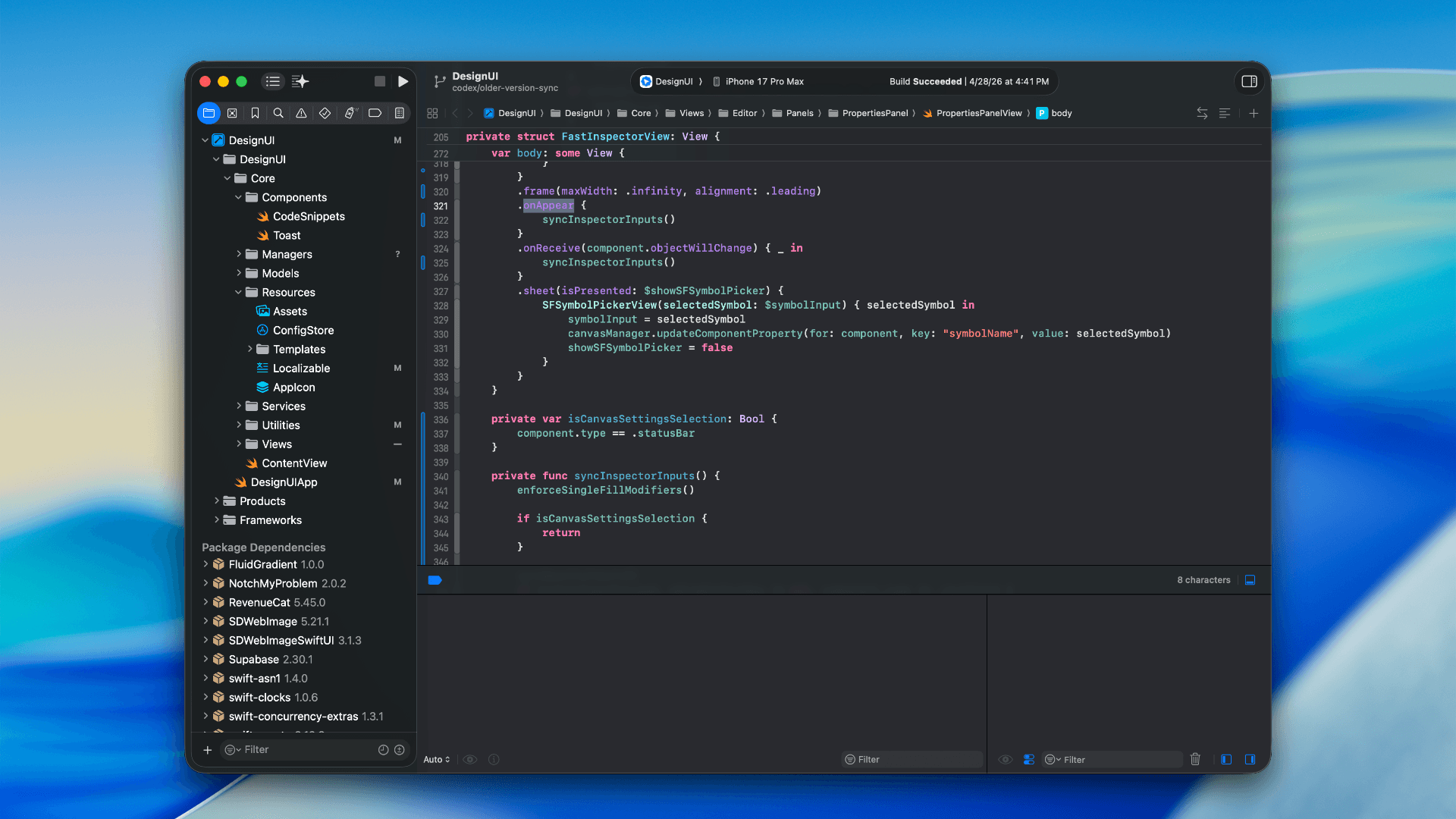
How to optimize your SwiftUI app in 2026
Discover top strategies to optimize your SwiftUI app in 2026, enhancing performance, responsiveness, and maintainability with modern concurrency.

SwiftUI: iOS Confirmation Alert (Confirm + Cancel)
SwiftUI iOS confirmation alert with Confirm and Cancel buttons. Beginners guide to building safe actions, destructive deletes, and commit dialogs.
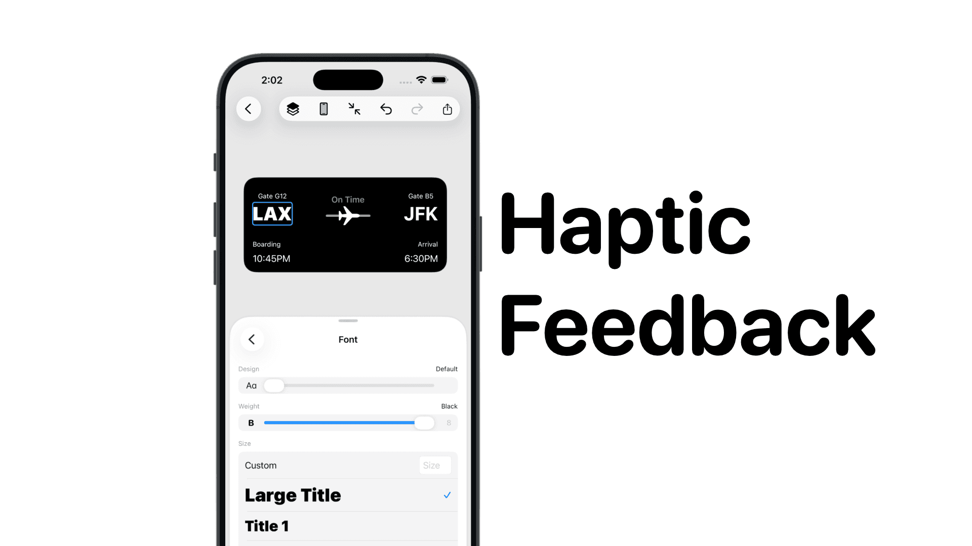
SwiftUI: IOS Haptic Feedback Guide 2026
Add click to vibrate haptic feedback in SwiftUI. Full guide to UIImpactFeedbackgenerator, success, error, selection, and tap vibration patterns with code.
Code copied to clipboard!